
One thing I've always found appealing about the Raiders and 49ers is their color schemes - not only are they both precious metals (the silver and gold of the helmets), but they complement each other so well. They wouldn't have as much appeal if, say, they had the colors of the Vikings (purple) and the Chiefs (red), which are not bad alone, but not complementary and representing more or less the same geographic area. Together with the oh-so-awesome silver and gold helmet colors are those fantastic Raiders and 49ers logos, which are timeless, or at least should be.
Looking around the Internet, I am amused to see that lots of fans also have strong opinions about the aesthetics of team designs. The striped helmets of the Cincinnati Bengals elicit passionate debate, and some even prefer the old helmets which I thought were simply pathetic: they looked like Cleveland Browns helmets with the word 'Bengals' printed on them - and sometimes, not even??
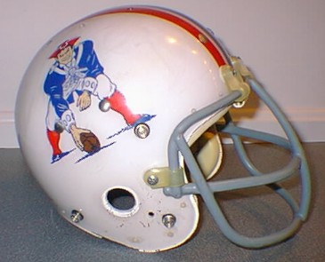
I may even have mentioned this before, but I can't imagine the Patriots or the Buccaneers ever winning the Super Bowl championships they did with their old logos/helmets. Some logos are timeless, some have thankfully changed, and some should still be changed.
Subscribe to:
Post Comments (Atom)
No comments:
Post a Comment